


How could climate change transform the electricity market revenues of renewable energies? Future climate change will impact today’s investment decisions in renewable generation plants, as power prices are influenced by, among other things, the weather. Fundamental power price scenarios have not yet taken this into further consideration. Energy Brainpool has therefore developed the concept of a climate-sensitive “weather swarm”.
This concept can be used to calculate consistent P50 power price curves for different markets. These can map climate-related changes over time, which affect the expected revenues from renewables. In Germany, for example, they will increase by up to 30 % in some years compared to the standard scenario. An exclusive look at the approach explains how it emerged from the classic application of weather years and what advantages it offers.
Modeling weather in power price scenarios
Fundamental power price scenarios serve to show possible developments in electricity prices in the coming years and decades. This makes it easier, for example, to evaluate the economic viability of generation plants or other projects. The analysts at Energy Brainpool calculate the power price scenarios using the fundamental electricity market model “Power2Sim”. It simulates the supply and demand on the electricity market on an hourly basis – the so-called “merit order” – assuming a variety of model parameters up to 2060.
The following factors influence power price formation:
- the available power plant fleet, given by the installed generation capacities and short-term power plant availability,
- the demand for electricity,
- the market prices for commodities such as natural gas,
- CO2 certificates
- and the weather.
Weather elements include temperature, amount of precipitation, wind speed or degree of cloudiness. These factors influence power pricing not only on the generation side of solar systems, wind turbines and hydroelectric power plants. In contrast, it also has an impact on the demand side, for example, on heating or cooling requirements.
Fundamental electricity market modeling must therefore make assumptions about the weather well into the future. Of course, it would not be practical to make specific weather assumptions for every hour over the next 30 years. Because it is not possible to predict the weather patterns that will actually occur during this period. Instead, electricity market models often rely on historical “weather years”: it is assumed that a future model year has the same values or patterns as a calendar year in the past in terms of temperature and the generation profiles of renewable energies (wind and solar).
Special factors in regeneration production
When it comes to renewable energy generation, a distinction must still be made between the “distribution” of the feed-in profiles during the year and the total annual generation. The former is often presented in the form of so-called capacity factors. For example, an hourly capacity factor of 0.5 for onshore wind indicates that 50 % of the installed rated capacity was generated in a given hour. This can apply to an individual system as well as to the entire onshore generation in Germany, for example.
If you add up the capacity factors over all hours of the year, you get the so-called full load hours (FLH), which, multiplied by the installed capacity, results in the total annual generation.

Figure 1: Monthly capacity factors for onshore wind for selected years (Source: RenewablesNinja)
Figure 1 shows the monthly average capacity factors for onshore wind in 2006, 2009 and 2014. This refers to the total currently installed capacity in Germany. It illustrates that there are not only differences in the number of full-load hours between weather years, but that the feed-in profiles also differ significantly in terms of the distribution during the year. For example, the year 2006 had a higher number of FLH (1595 h) compared to the other two years (1568 h in 2009 and 1559 h in 2014, respectively). However, average production was lower, particularly in the first two months of the year.[1]
The choice of the feed-in profile as well as the temperature assumptions directly influences the hourly electricity price formation via the merit order. In summary, it can be said that the results of a power price scenario depend to a considerable extent on the choice of the specific weather year.
Weather years and the “p50 curve”
Energy Brainpool currently uses the weather year 2009 in its power price scenarios for the entire period under consideration. In other words, in each model year from 2024 to 2060, the assumptions regarding (1) the distribution of the capacity factors for renewables during the year and (2) the temperatures correspond to the corresponding time series from 2009.
The assumed full-load hours for wind and solar and thus the total annual generation can change over time depending on the technology; the historical capacity factors are scaled up or down depending on the assumption.
Of course, it would also be possible to change the weather year over the course of the modeling period or even to assume a different weather year in each model year. However, in the “standard version” of a power price scenario as described so far, the choice of such a sequence of weather years would inevitably be arbitrary and inconsistent. Accordingly, the weather year 2009 will be kept constant over time. Analysts selected 2009 weather year by comparing various historical weather years in a particular scenario.
More specifically, the simulated annual average curves for the electricity price – the so-called “baseload price” – were compared in the largest European countries for the different weather years. And identified the weather year that provided the middle curve in terms of the median or “P50 value”. This also results in the interpretation of the results of a power price scenario as a “P50 curve”: the simulated baseload prices correspond to the P50 expected value with regard to a sample of historical weather years.
However, this interpretation raises the question of the extent to which it can be generalised spatially and temporally. This means in detail:
- The choice of weather year was calibrated to a specific size (baseload price) and specific countries. It is not clear where in the distribution of all weather years the year 2009 should be located for other countries and/or other time series, for example, capture prices[2], and whether it meets the assumption of a P50 curve in these cases.
- Due to climate change, weather patterns or the probabilities of certain types of weather years changing. For modeling this means that the weather year 2009 can be a good choice as a P50 assumption for the coming years. However, if certain historical weather years fall out of the sample as a result of climate changes over time, the validity as a P50 assumption for model years further into the future, for example 2050, is limited or no longer exists.
Alternative to a fixed weather year: the weather swarm
A solution for a valid P50 electricity price curve regardless of country and model year is a so-called “scenario swarm”. A given scenario is not only calculated once. Instead, a large number of scenario runs (or rounds?) – Energy Brainpool’s swarms usually consist of at least 1000 runs – are considered. Each of these has randomly chosen assumptions for certain model parameters.
In the case of a weather swarm shown here, the underlying weather years vary from run to run. Specifically, this means: for each run, a new sequence of historical weather years, one per model year, is randomly drawn. This approach can be extended to include other randomised parameters, such as raw material prices or electricity demand.
What are the probabilities of certain weather years?
In the simplest case, one could assume a constant uniform distribution of all historical weather years: each weather year in a given model year is drawn with the same probability, for example 1/35 for a historical sample from 1985 to 2019. This probability remains constant across the model years. With this approach it is possible to calculate a spatially valid P50 curve for any time series:
- From the results of the individual runs, a frequency distribution can be determined for each individual model year, for example for the baseload price. Such a frequency distribution is illustrated in Figure 2. With a sufficiently large number of scenario runs, the frequency distribution approaches the “true” probability distribution.
- The year-specific P50 value can be derived from the distribution shown. It indicates a limit that the baseload price exceeds with a probability of (approximately) 50 %.[3]
- If you repeat this evaluation for each model year, the result is a P50 curve that does not correspond to a single scenario run, but contains the observed P50 value across all scenario runs for each year.
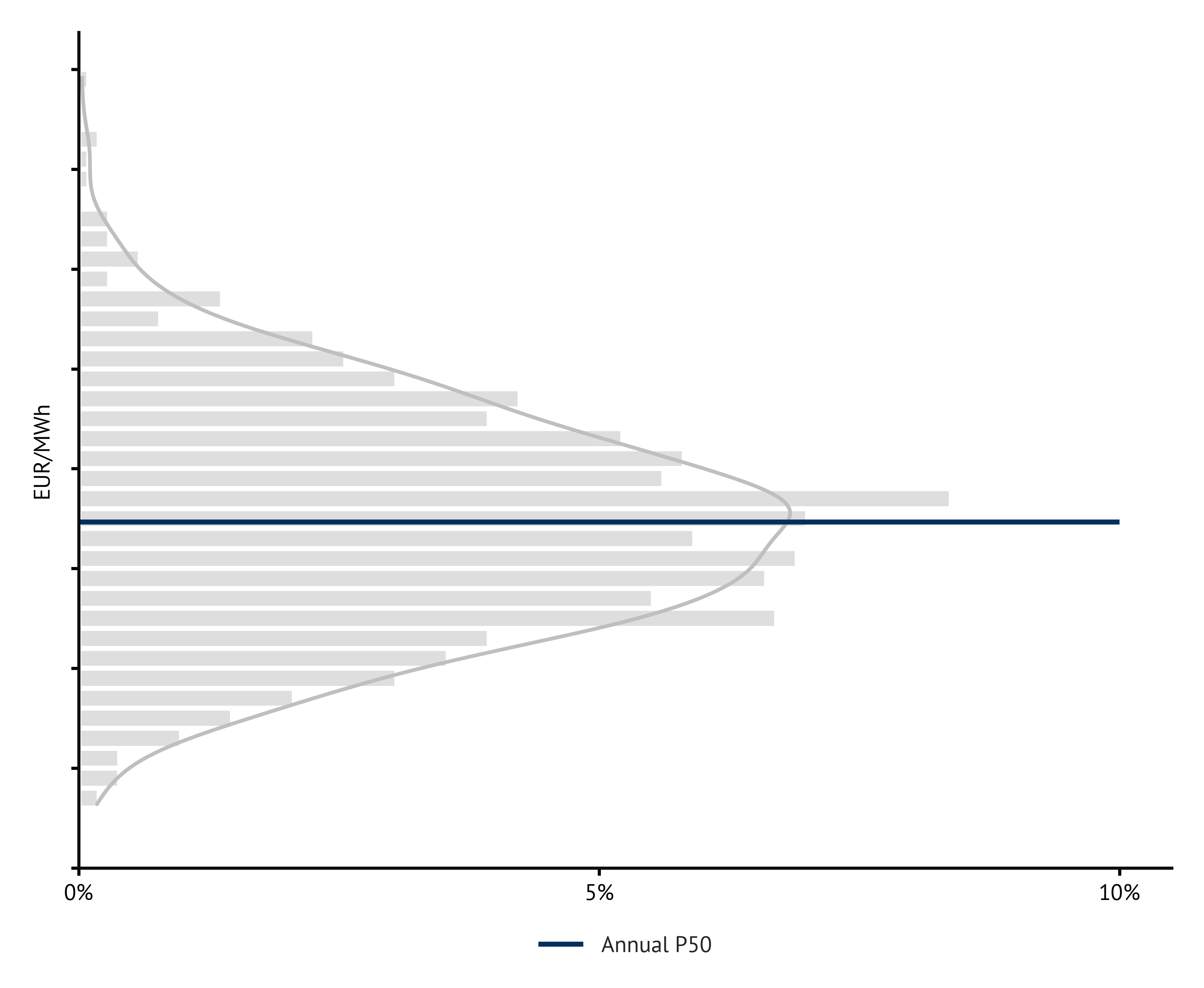
Figure 2: Example distribution of baseload prices in a scenario swarm (Source: Energy Brainpool)
In other words, for each country, time series, and model year, this curve reflects the value resulting from the P50 weather year specific to that combination. Figure 3 compares the baseload price curves from Energy Brainpool’s standard scenario “Central”[4] for two smaller countries, Netherlands and Portugal, with the corresponding P50 curves from a Central weather swarm with identical occurrence probabilities.
While the two curves for Portugal are very close to each other throughout almost the entire period under consideration from 2030 to 2050, the P50 curve for the Netherlands is slightly higher almost throughout. This suggests that the weather year 2009 for the Netherlands did not quite correspond to the P50 expected value.

Figure 3: Baseload prices in the “Central” scenario and the associated weather swarm (P50 curve) for the Netherlands and Portugal (Source: Energy Brainpool)
Climate change in the weather swarm
A weather swarm in which all weather years can be drawn with the same probability solves the first of the “caveats” of a normal power price scenario described above, the limited spatial generalisability as a P50 curve. The limited temporal generalisability can be solved by assuming the underlying distribution of historical weather years not to be constant but to change over time.
In other words: in order to take future climate changes and their effects on the results of power price scenarios into account, probabilities of occurrence are assumed for individual weather years, which depend on the respective model year. The further into the future the model year is, the higher the probability that a warm weather year will be drawn.
This relationship is shown in Figure 4. It shows the model years up to 2050 on the x-axis and the probabilities of occurrence of the weather years in the sample (1985 to 2019) on the y-axis. The probability of warm weather years, especially 2014 to 2019, is increasing continuously over time. The exact probability of occurrence values were adjusted so that the resulting expected temperature increase for a given weather year corresponds to the simulation results from current climate modeling studies.
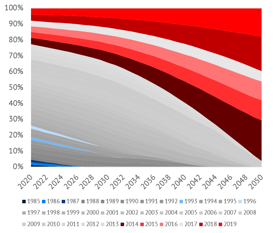
Figure 4: Probabilities of occurrence of the historical weather years for the model years in a climate-sensitive weather swarm (Source: Energy Brainpool)
If one now compares the results of such a “climate-sensitive” weather swarm with those of a power price scenario with a fixed weather year, the influence of climate change on future baseload and capture prices can be estimated. Figure 5 shows this comparison for the current “Central” scenario in Germany, for the capture prices for onshore wind and solar.
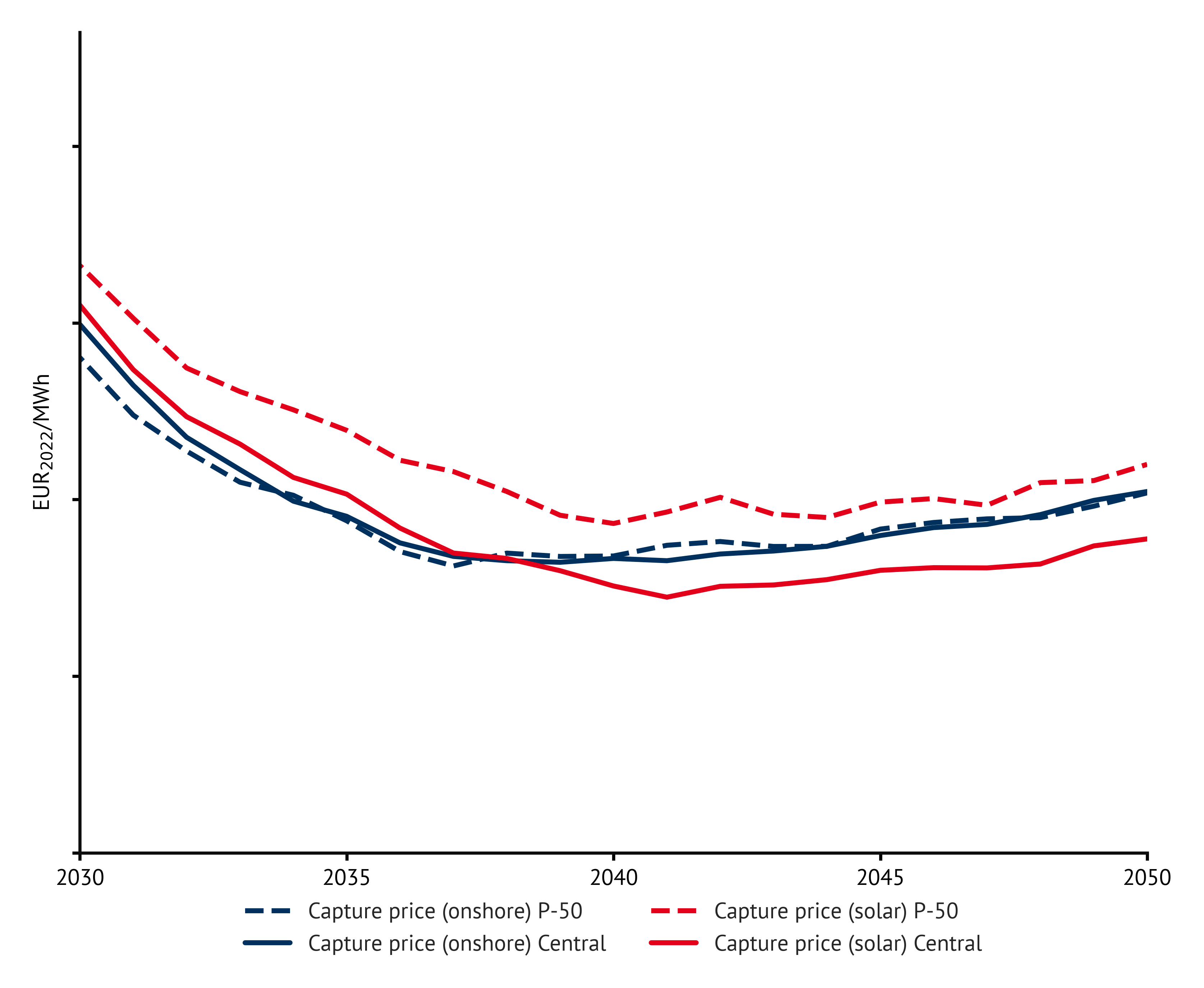
Figure 5: Capture prices in the “Central” scenario and in the associated weather swarm (P50 curve) for Germany (Source: Energy Brainpool)
It is noticeable that the capture prices for onshore wind differ only slightly. In contrast, the capture prices for solar in the weather swarm are increasing significantly. This can be explained by the feed-in profiles, particularly of wind, in the different weather years. Figure 1 above has shown that the year 2014 has a stronger “seasonal imbalance” in terms of electricity generation from wind than the year 2009: In the winter months, the capacity factors, and thus the potential feed-in, are significantly higher in 2014. On the other hand, they fall behind 2009 in the summer and autumn months.
This pattern can not only be observed in 2014, but can also be seen in the average of the warm weather years up to 2019. Solar systems benefit from this seasonal imbalance: in the summer, where the majority of their electricity generation takes place, there is less simultaneous feed-in from wind turbines. As a result, the number of hours with low or even negative power prices decreases. As a result, solar systems not only receive higher prices for their electricity, they also switch off less frequently and therefore feed in more electricity.
Power prices do fall in the winter months. The bottom line is that the effect dominates in summer. This increases the annual capture price for solar by up to 30 % compared to the standard scenario, depending on the model year.
For onshore wind, on the other hand, when comparing the warm weather years with 2009, there are two effects that almost cancel each other out: more feed-in at lower prices in the winter months, but less feed-in at higher prices in summer and autumn. As a result, capture prices hardly change, at least on an annual average.
In summary: On our view, a climate-sensitive weather swarm represents the best approach to model future weather patterns in power price scenarios using historical weather years. Not only does it enable the calculation of a consistent P50 power price curve for each application, but it can also reflect climate-related changes over time. In this way, analysts can better assess future impacts of climate change on relevant variables such as capture prices. The concept of the weather swarm also leads to a new risk assessment for electricity market revenues, especially from solar systems.
More about power price scenarios: Power Price Scenarios Swarms | Energy Brainpool
Notes
[1] The fact that so-called “cold lulls” can occur in January and February with the feed-in profiles of the weather year 2006 was discussed in an earlier blog post. https://blog.energybrainpool.com/neue-studie-supply-security-in-a-cold-dark-flaute-is-climate-neutral-and-at-adequaten-costs-possible/
[2] The “capture price” for wind or solar is the volume-weighted average revenue that can be achieved for the respective technology in a certain period of time, for example a year, for the amount of electricity that can be generated. It is assumed that the systems are curtailed in hours with negative electricity prices and do not generate.
[3] In addition to the P50 value, other P values can be determined analogously, e. g. B. a P90 value or P10 value.
[4] You can find more information about our current power price scenarios here: Power Price Scenarios | Energy Brainpool
What do you say on this subject? Discuss with us!